Recently, well, last November I was tasked with improving the error messages and overall experience around errors in Astro (so, we're talking errors for users who are developers, here).
To be honest, I didn't necessarily have any experience in the domain. I just code monkey all day and sometimes the errors messages are good and sometimes they're bad, for some reason.
Since I usually do try to be proud of the work I do, I studied various projects, watched many talks and learned a bunch. Here a few of my takeaways.
Just don't have errors (lol)
Ultimately, errors always suck. Even the nicest and most informative messages will always be a bad experience for the user, things are funnier when they work.
Unless your software is very important getting to an error state shouldn't be impossible, but it should be hard. The usual things all applies here: Intuitive APIs, good documentation and other resources, helpful tooling... All of those are as important, if not more than good errors.
Good errors are honest
A mistake I see too often is not taking into account the user's point of view. This come in multiple forms:
- Over technical messages that are ultimately unhelpful (
0x75ba98: index out of bounds) - Trying way too hard to be kind and goofy (
Oopsy daisy! There was an error with accessing this index!)
I'd like to bring particular attention to the second one, because while it can be seen as the most "human" or "respectful" one, it's a common mistake to forget the most important part of error messages: You only see them in bad times.
This tone minimizes the significance of the error, which is important to the developer. The developer may be frustrated and your error message shouldn't be making jokes about their struggles.
-- The Astro Error Writing Guide
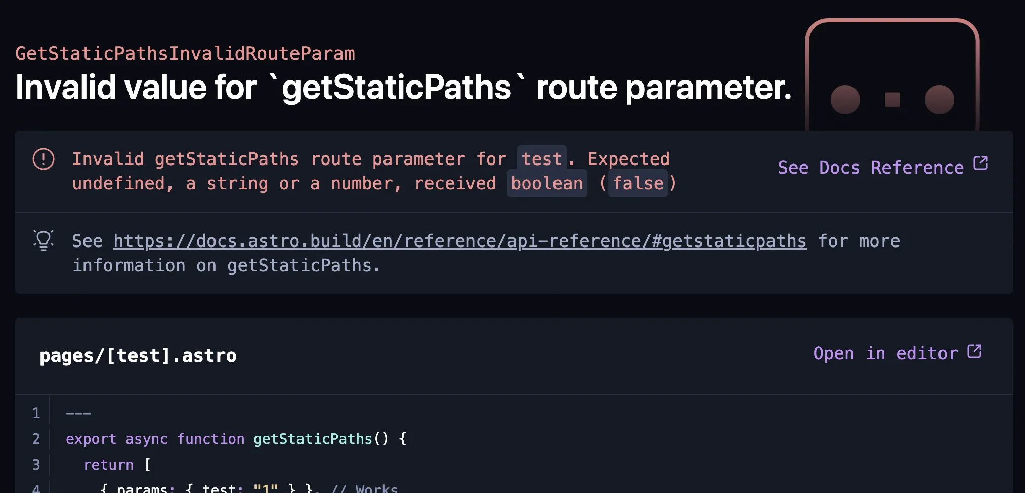
In this specific example, I think the technical message isn't actually that bad. It's just lacking in useful information. Adding what index was accessed, the array name and length and removing or putting less emphasis on the memory address (Unless it's actually relevant) would probably be enough.
Good errors are nice to look at
Both in the terminal and in the app, error messages can and should look good. Not only can they be aesthetically pleasing, the visuals can also be done in a way that maximizes the user's attention toward the key elements that would help them solve their issue.
Having properly designed visuals also brings all the usual benefits that good design do: everything is responsive, proper accessibility was ensured and the overlay experience is lovely.
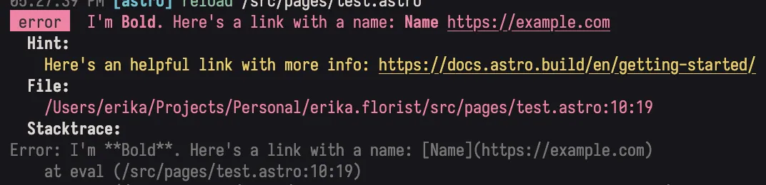
In the message themselves you can also do some visual work: add some bold to key elements, some inline code styling, maybe even italics if you have a nice hint that needs nuance.
For Astro, I added partial Markdown support that works in both the web overlay and the terminal so developers can write cool error messages in a language they're comfortable with.
Additionally, although this is more of a writing thing than a look one, keeping the error message easy to read, concise and to the point is also important. If you have a lot of information to convey, consider adding a separate hint or a link to a resource that can help. Users don't want to read your error messages.
Good errors are a cultural thing
To ensure errors are good in Astro, always and forever, it needed to be more than just "Erika did a pass once and made the errors better". Every other Astro maintainers, and future ones as well needed to know how to make good errors.
As such, the first thing I did, before even rewriting any errors was to write a guide for other maintainers. The guide reside in a README.md, next to where all the errors are defined. so it's easy to find (and update) when needed. It's also linked in a comment at the top of the error definition file, so it's hard to miss.
The result is that I don't need to review all the Pull Requests adding / modifying errors, I trust that the maintainers will do a good job. And if they don't, I (or someone else) can just point them to the guide.
Good errors are...
Finally, a few more things that I think are important to keep in mind when writing errors:
Good errors don't change (too much)
Users should have a static way to find their errors when looking through your documentation / searching the web. Think HTTP status codes.
For Astro, we decided to include a name for each error that we don't change. Updating the message itself is fine, but the name should stay the same.
Good errors are actionable (if possible)
If you can, provide a solution to the problem. If you can't, provide a link to a resource that can help. Get the user back on track as fast as possible.
Good errors have contextual information (when applicable)
In addition to the file and line number (and maybe a box showing around the code where the error is), adding contextual information can be very helpful.
For example, Could not render ComponentName is more helpful than A component could not be rendered.
Additional resources
Some resources I found helpful while working on this project
- Compiler Errors for Humans
- When life gives you lemons, write better error messages
- RustConf 2020 - Bending the Curve: A Personal Tutor at Your Fingertips by Esteban Kuber (part on error messages starts around 19:17)
- The Error Model
A lot more resources can be found by searching for "error messages" on your search engine of choice, however, I found that most of them were too general and not specific enough to the domain of developer experience, so while interesting, they weren't always helpful.